The pros
The general consensus on Formula 1’s new Halo device seems to be that it’s a bad thing. Ugly, offensive, and unwelcome. No matter how hard I try, though, I simply cannot get my head around why.
When the motive of Halo is to protect our heroes–stop them from suffering head injuries, or dying–why on earth is its appearance relevant? Why do we care that it’s not as smoothly integrated as it could be, when its purpose is far, far more important?
Even if you are a dedicated aesthete, it’s not like F1 cars are particularly pretty these days anyway. They’ve been sprouting ungainly aero elements for years, and I struggle to see why the protective Halo is more offensive than any of these. And surely better integration will come in time.
“We can’t see the drivers” is another argument. Sure, but helmets have stopped us seeing their faces for years. Perhaps they’d have been greeted with similar scorn if social media was around on their arrival. And are viewers really focusing on drivers’ helmet designs as they blitz around a circuit? Their cars’ liveries ought to be useful enough in working out who’s who.
Halo–or something like it–may or may not have help saved Jules Bianchi’s life, but his death is still recent, and very raw. It means we know only too well the anguish that death in F1 brings. The bravado and excitement that the sport’s inherent dangers bring count for nought when there’s a driver to mourn.
Yet a device designed to minimize the chances of us having to mourn any of the sport’s current drivers is being maligned simply for not being as good to look at as it could be. Am I alone in seeing that as completely mad?
The cons
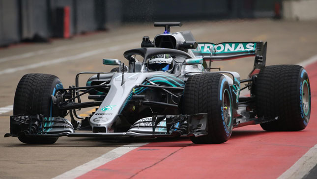
With a flurry of 2018 Formula 1 cars slowly being revealed, it’s only now that we are starting to see how the Halo safety device will affect the cars’ looks, and possibly our enjoyment.
As I watched the Red Bull go around Silverstone, I noticed how very little I could see of the driver and subsequently the driver’s helmet and colors. Which is a shame, and ironic that so many drivers are releasing new designs only for them to be hidden.
Growing up with the sport, I used to love recognising a driver’s colors and, being from the Top Gear art department, I’m still a big fan of helmet designs (if they are done well).
So it got me thinking about the best helmet designs over the years, because surely, for now, that enjoyment has gone. Do you agree with my list?
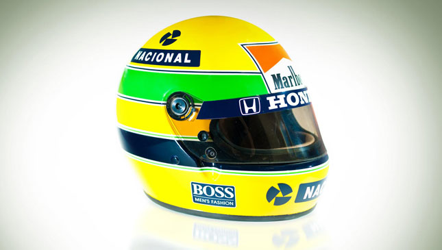
1. Ayrton Senna: Bold, simple the most iconic of them all?
2. Gilles Villeneuve: At the time, extremely modern and quirky.
3. James Hunt: Does what it says on the tin. Just like Hunt.
4. Graham Hill: Simple, and based on the London Rowing Club colors.
5. Francois Cevert: Can’t go wrong with bold stripes.
6. Elio de Angelis: Angular and confident.
7. Mario Andretti: One main color, one stripe. Done.
8. Jenson Button: His original helmet made the Union Jack work well
9. Alain Prost: Very Eighties in its approach and design.
10. Stefan Bellof: Solid black with the Belgium flag as stripes. Just drips coolness.
Mind you, while compiling this list I realized there aren’t many modern day drivers’ helmets in there. Maybe the Halo isn’t so bad after all…
NOTE: These articles first appeared on TopGear.com. Minor edits have been made.