

Several automakers have been adopting new logos this decade. From what we’ve been observing, manufacturers are opting for the ‘minimalist’ look, giving a more 2D effect. So far, most of the German automakers have gone for that type of logo, along with a couple of Japanese marques.
Perhaps it’s a trend of the decade, but we wouldn’t be surprised if more companies go for that design down the line. That brings us neatly to Ford.
OTHER STORIES YOU MIGHT HAVE MISSED:
Can my child ride a motorbike? A full guide to the Children’s Safety on Motorcycles Act
This is how Nissan celebrates 50 years of the Urvan
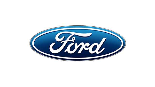
The American automaker is one of the latest automakers to go for the 2D logo. It sneakily made its debut in the updated F-150, and it’s likely we can expect it to appear in more models down the line. But at first glance, you probably won’t notice what’s new immediately.

What’s different, you ask? For starters, the chrome border is gone and replaced with a white one instead. Also, the Ford font is written in white and not chrome. It’s somewhat reminiscent of the company’s logo from the late ‘60s, but with a slightly more modern twist.
Granted, the change isn’t as dramatic as that from other automakers that have gone for the simplified 2D look. Nonetheless, it’s familiar and instantly recognizable. The Ford typeface has been like that for nearly a century, and we doubt Ford wants to do anything hugely dramatic with it.
So, like the new look? Chime in the comments below.