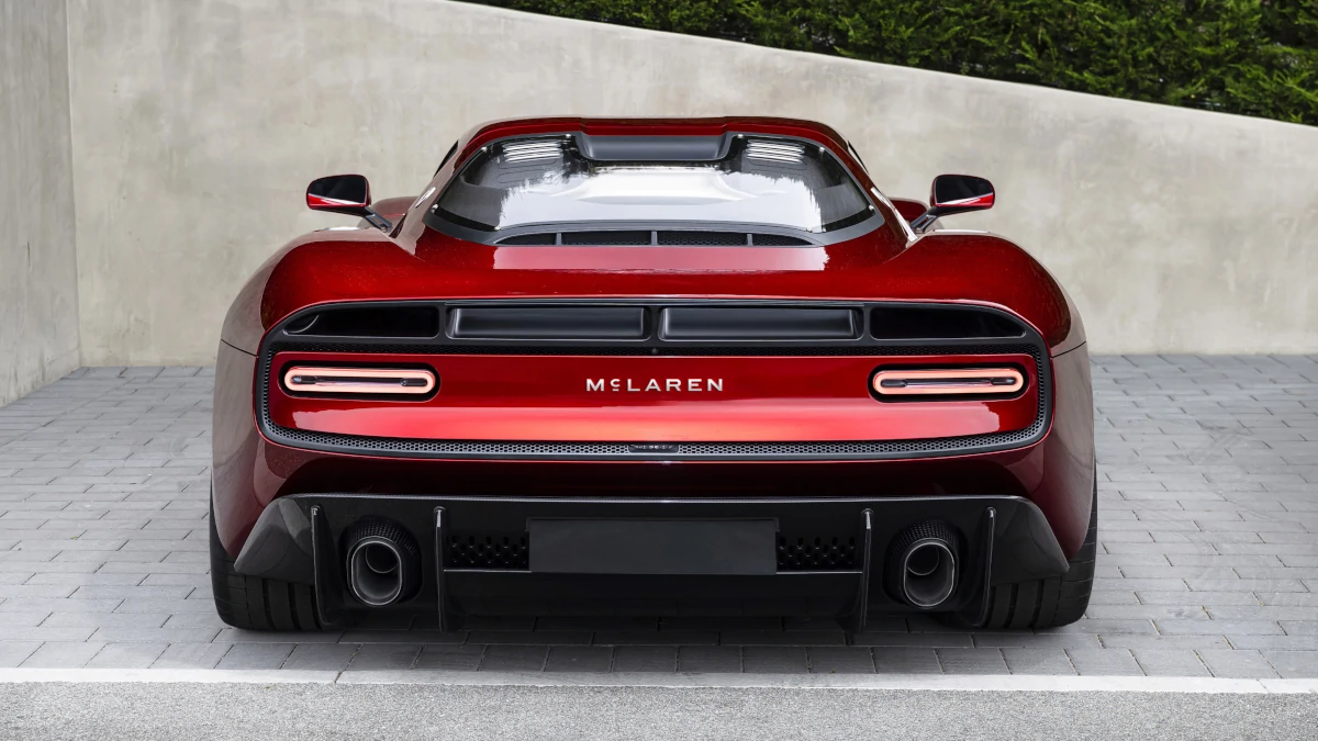
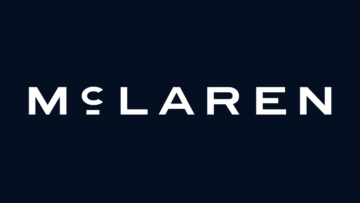
McLaren has a new logo. That’s it up above. Surprise! It says ‘McLaren.’
There’s plenty of history behind this “evolved brand identity,” though, because the fresh wordmark was inspired by the sign that used to sit above the family fuel station in Remuera, Auckland. That’s where Bruce built his first winning race car, and it’s probably why the new logo works so well on the back of the retro, manual McL 6GT.
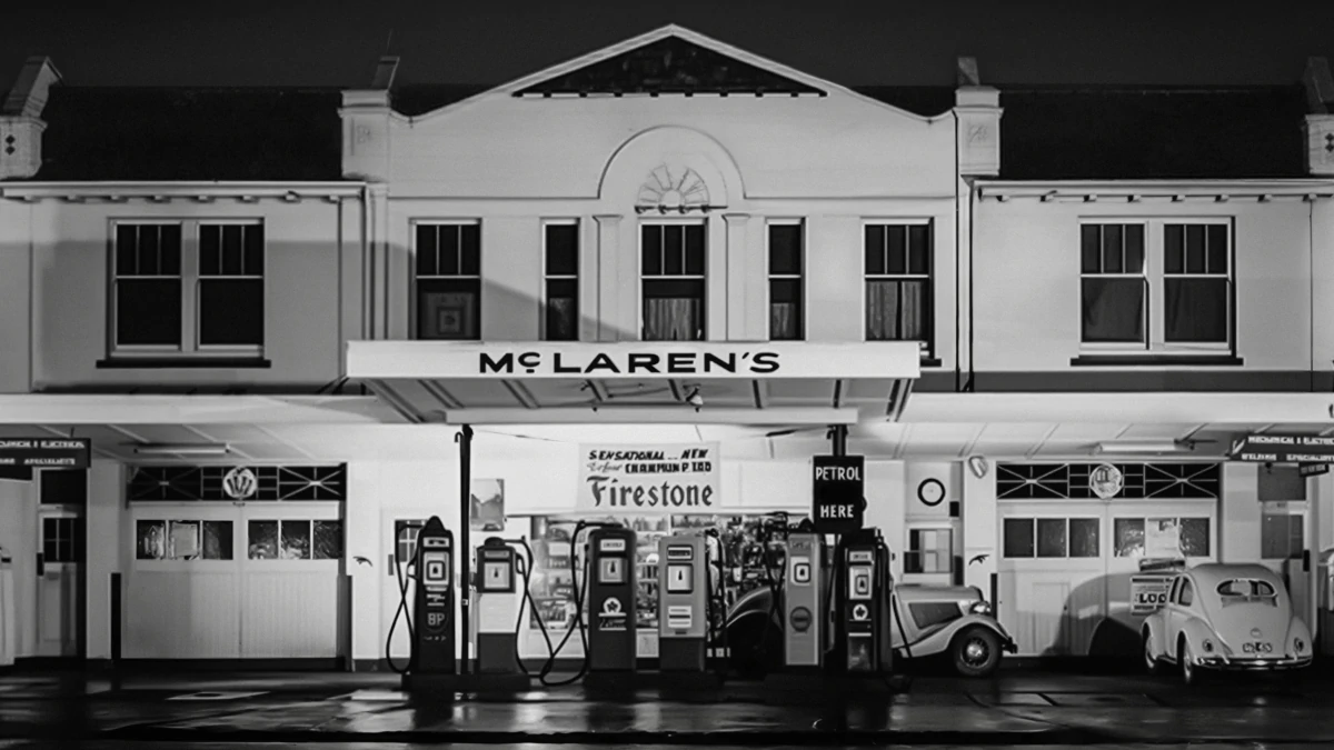
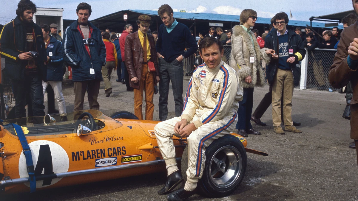
McLaren’s chief creative officer David Woodhouse assures us that the old ‘speedmark’ logo will continue, but that this new wordmark will “dominate” and will be adopted by both the Automotive and Racing branches of the business.
OTHER STORIES YOU MIGHT HAVE MISSED:
Should Nissan have a small hatchback like the all-new Pixo for Asian markets?
Variants, prices, specs: What you need to know about the all-new Xpeng L03
We’re told that it creates a “clearer and more unified expression of McLaren,” and that it’ll mark the beginning of “a renewed focus on Bruce McLaren’s story.”
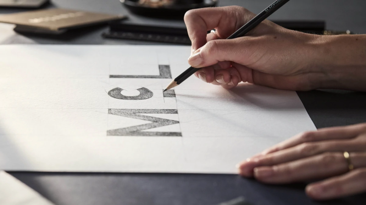
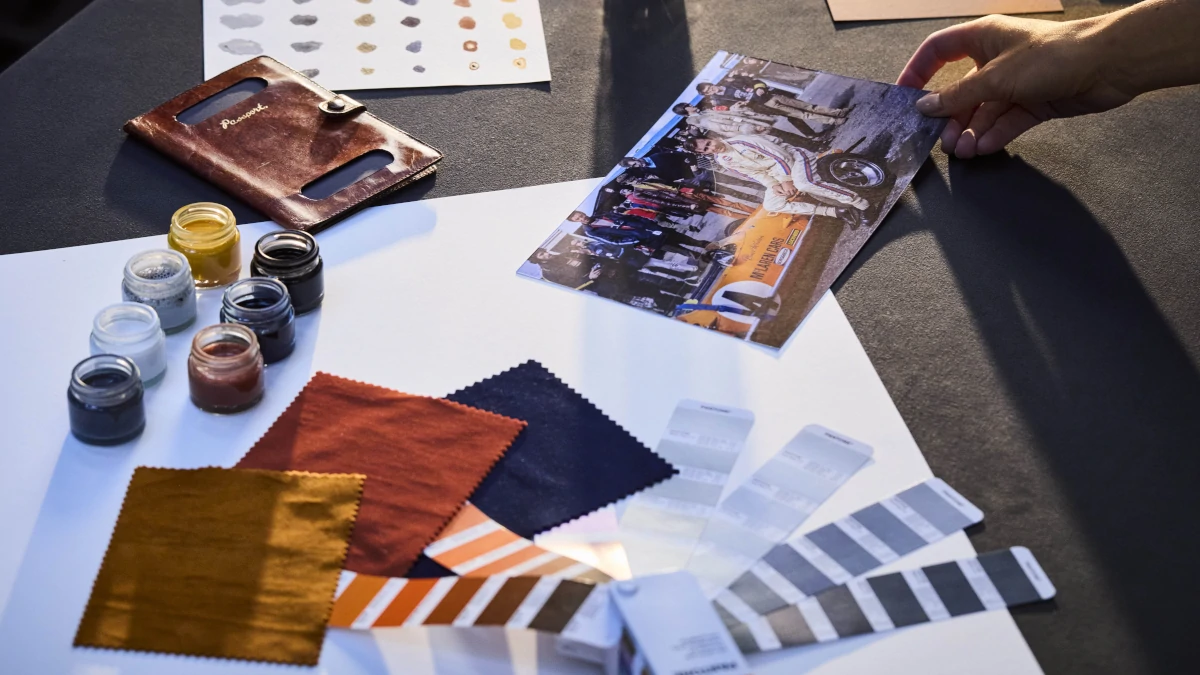
Papaya will remain as the dominant color of the various racing teams, but the ‘Midnight’ (aka navy blue) that you see above will become a signature of the road cars. Apparently, that’s part of “an expanded colour palette inspired by pivotal moments in McLaren’s history.”
What do we think? Ready to hear more about McLaren’s past as it heads toward an SUV-filled future?

NOTE: This article first appeared on TopGear.com. Minor edits have been made.