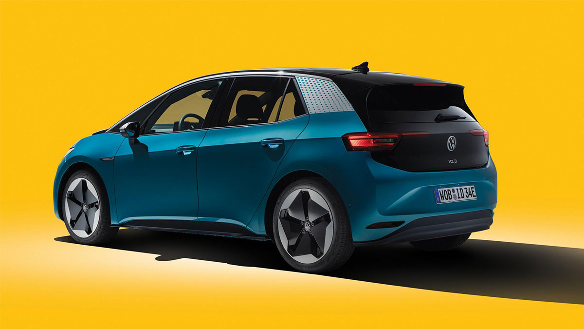
So this is the Volkswagen logo’s new look: simple, clean, and similar to the last one. It was unveiled at the 2019 Frankfurt International Motor Show and marks the beginning of new era for the company.
In its statement, the company describes the logo’s new appearance as “modern, clearer, and simpler,” with the familiar pair of letters “reduced to its essential elements.”
It’s flat now, with thinner lines. A darker shade of blue has also been thrown into the mix (though the company did mention the possibility of additional color variants). In the German carmaker’s own words, “Volkswagen will have a sound logo for the first time.” Future applications of the logo on Volkswagen cars will also be illuminated.
![]()
The hope is that the new two-dimensional design will be more flexible in use and easier to recognize in the digital age.
“The new visual language of the brand will be very different from that presented by Volkswagen to date—it will be bolder and more colorful. The focus will be on people. Volkswagen will no longer concentrate on perfectionism in vehicle photography. In the future, the main objective will be to present realistic situations that customers can identify with,” the statement reads.
According to VW board member Jürgen Stackmann, the new brand identity is the “start of the new era for Volkswagen.”
“By formulating new content and with new products, the brand is undergoing a fundamental transformation towards a future with a neutral emission balance for everyone,” Stackmann adds. “Now is the right time to make the new attitude of our brand visible to the outside world.”
The implementation of Volkswagen’s new brand identity is expected to be completed by the middle of 2020. All in all, 171 markets in 154 countries will be adopting the new design.
It’s a neat new look, but frankly, we’ll reserve real judgment for when we actually see this updated ‘VW’ on one of the German manufacturer’s products. What do you think of Volkswagen’s new logo? Yay or nay?