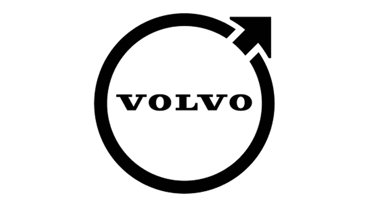
In case you haven’t seen it yet, Volvo just unveiled a new logo. There were no press releases, no big announcements—nada. The brand just quietly updated its profile pictures on various social media platforms.
Thanks to the people of the Internet, the change didn’t go unnoticed. Besides, the changes are hard to miss. The new Volvo logo now sports a minimalist look, taking a ‘less is more’ approach to the design. Frankly, the transformation’s a bit similar to what Nissan’s logo went through.
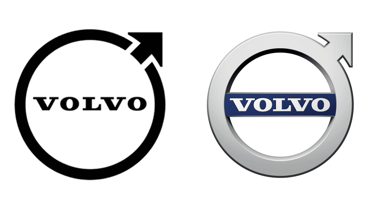
All elements of the logo have been blacked out, and all the lines are now thinner. The arrow is still in the same spot as before, but it has now created a gap along the logo’s main ring. The blue bar at the center of the badge, meanwhile, has also been removed entirely.
If you want to see the changes for yourself, here’s the new logo beside the old one below:
Again, Volvo hasn’t announced anything yet as of this writing, so we’re still not sure if this change will be permanent or not. Official materials aren’t available on the carmaker’s media and press sites yet, either. That said, it’s worth noting that even Volvo Philippines has already updated its display photo on Facebook with the new logo.
What do you think about Volvo’s new badge? Do you like the new look?
