
Honda is giving its future electric vehicles an old-school touch with a new retro-look ‘H mark’ logo unveiled at the 2024 Consumer Electronics Show.
Worn by the two ‘0 Series’ concepts launched at the event, the new logo is heavily inspired by the first H emblem from the early ’60s, first used by the T360 pickup in 1963. The Japanese carmaker says the design “symbolizes two outstretched hands” and “represents Honda’s commitment to expand the possibilities of mobility and continue to meet the needs of its customers.”
OTHER STORIES YOU MIGHT HAVE MISSED:
Will there still be a next-generation Toyota Rush?
Is Ford finally building a more hardcore Everest?
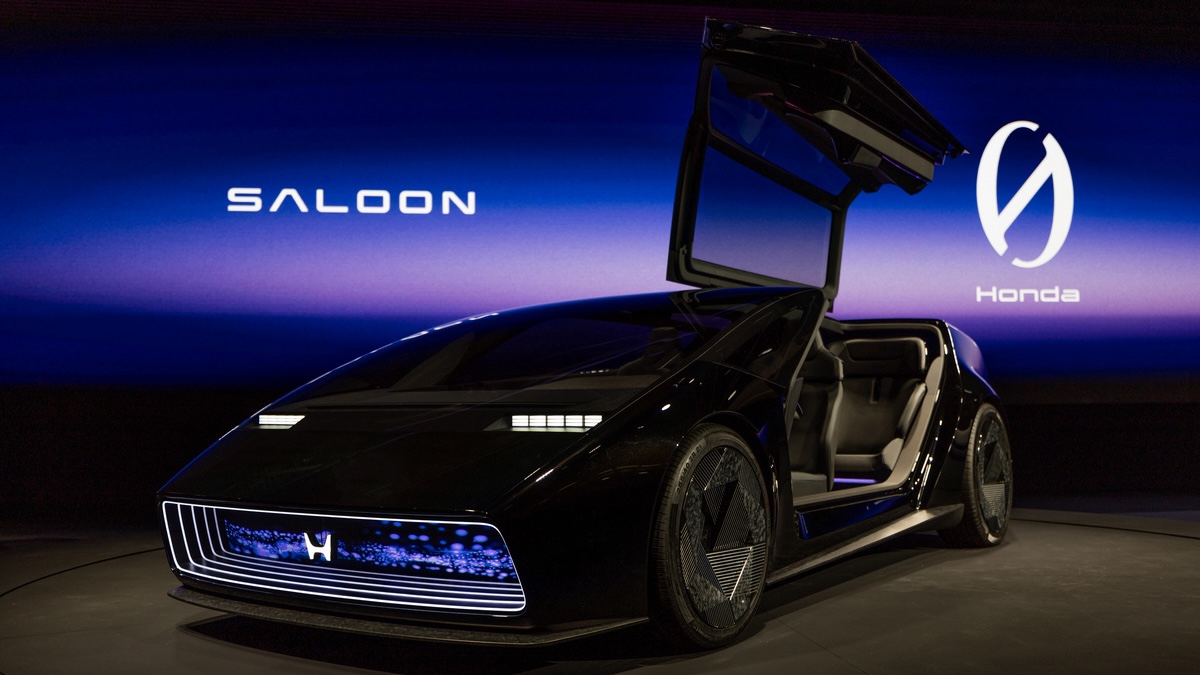
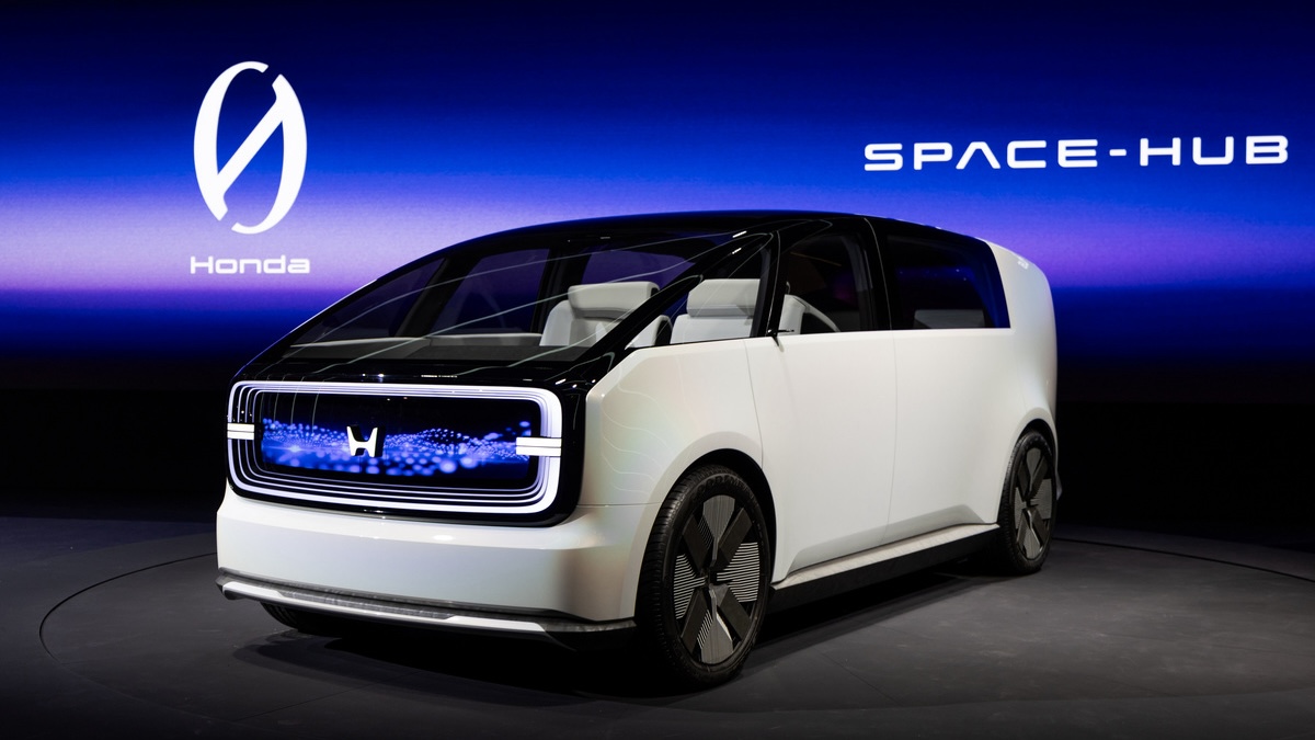
We have a separate story on 0 Series, but the gist is that it’s a new global EV series and the first models will be rolled out in 2026. And as you can see from the images above, the Saloon and the Space-Hub may be wearing a retro logo, but their designs are far from retro. Both concepts follow the core princicples of ‘Thin, Light, and Wise,’ which Honda says “counter the traditional constraints of battery electric vehicles while building on long standing Honda engineering philosophies like ‘M/M’ [or] man maximum/machine minimum.”
According to the official release, the new H mark will be used on future Honda EVs, so it won’t be exclusive to the 0 Series; no word on whether it will be retroactively applied to current electric models when they’re due for a refresh. So, what do you think of this new logo, and how do you think it compares to recently redesigned ones from the likes of Nissan, JLR, Volvo, and Kia?